|
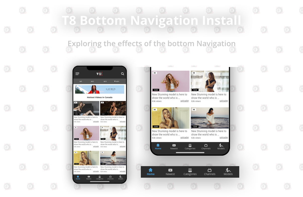
The bottom navigation has been around for a few years and has allowed for users to navigate and access information that would have otherwise been hidden inside the ‘hamburger menu’ - or worse, lost within the content. Today we explore how this can affect user experience and business goals. For the sake of this quick study, I will be putting more of an emphasis on the user experience as this was something I found that was very interesting and telling.
|
Disclaimer
Since this project(streaming) consists of a product that has content that is more on the sensitive side - I will illustrate through low fidelity wireframes and white labelled branding to ensure that whoever is going through this study can visually follow along without being exposed to sensitive content.
The Challenge
The task was very simple. Explore and rethink how users interacted with our homepage(on mobile). This may have been a tough(kind of vague) task but it was one that challenged me to be creative and really explore this particular product and improve on the user experience. We decided that since almost 80% of our users were on mobile(as opposed to desktop), this is the userbase we wanted to focus on - at least for this project.
The high level goal was to build brand loyalty and keep users coming back. This can be measured by:
The high level goal was to build brand loyalty and keep users coming back. This can be measured by:
|
Primary(user experience)
1. Delta on site visits 2. Delta on pages/session 3. Time spent on page |
Secondary(business goals)
1. Delta on ad views(and/or clicks) |
My Role |
|
I led the exploration and the design of this bottom navigation in the first half of 2019 and collaborated with my team that included a Senior Data Scientist, a Product Manager and Engineering. I also bugged my team of UX Designers and asked them for some critique and feedback.
This feature went live in the month of July 2019. |
The Product
This particular product is somewhat of a tester product and in a sense a guinea pig for our main product. In a sense, the innovation of features through this product allowed us to sample(to a smaller scale) and implement to our many product lines. We can take risks with this product and it allowed me to try something that has not been done through our other product lines. Despite it being a tester product, you will see that the sample size is still large enough to validate the data that was collected. The product largely generates revenue on PPC and PPV ads.
The Hamburger Menu
As it was previously constructed on this website - the home page navigation was for the most part through the hamburger menu. Users through the years have been accustomed and trained to go to the hamburger menu to navigate through websites and apps. Before the implementation of this feature - Users went to the hamburger menu 23% of the time when navigating through our site. Is it the most effective way to navigate through the site? Let’s take a look at the data.
Thanks to our amazing data team, I was able to look at the behaviours of our users in a holistic way. This was the relevant summary of the data collected:
|
-Users spent about 5 minutes in total per session
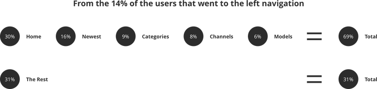
-Users viewed an average of 3.4 pages per session -There was a whopping 38% of bounce rate on the homepage(yikes) -Users were clicking on videos suggested on the homepage 28% of the time -Users were using the search feature 20% of the time -14% either refreshed the page or went into the hamburger menu to find a specific category or video or model. -Of the 14% that went into the hamburger menu - 80% went into Video and the rest went into Categories, Models and Tags. -Of the 80% that went into Video almost 68% went to the newest(latest) videos 23% went into Categories and the rest on Top Rated and Featured. |
Okay, so this is a lot of data - but this gives us an opportunity to look at the architecture and figure out a way to maximize the interaction for our users.
With only about a quarter of our users using the hamburger menu - This gives us a decent enough size of the users to pay attention to and find a solution for.
Introducing the Bottom Navigation
Theoretically, Introducing the bottom navigation with the highest traffic from the users that navigate throught the hamburger menu should cut the amount of interactions by half. This means that the 14% of users can have a much more efficient(almost half) experience through the addition of the bottom navigation.
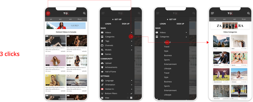
This is our current flow.
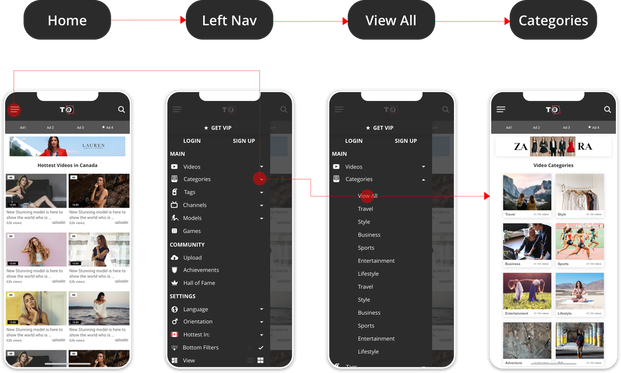
The hierarchy of the buttons were set by priority of user flow from the hamburger menu(on the video section)
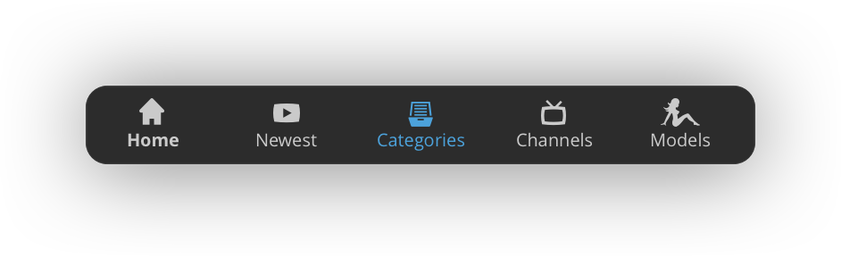
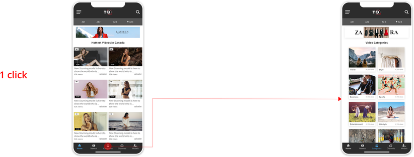
Below is the final iteration of our R1 navigation.
Below is the final iteration of our R1 navigation.
This was the result.
Impact
Primary(user experience)
1. Delta on site visits - 8% increase
2. Delta on pages/session - a whopping 47% increase
3. Time spent on page - an increase of about 7%
Secondary(business goals)
1. Delta on ad views(and/or clicks) - 2% increase
1. Delta on site visits - 8% increase
2. Delta on pages/session - a whopping 47% increase
3. Time spent on page - an increase of about 7%
Secondary(business goals)
1. Delta on ad views(and/or clicks) - 2% increase
|
Seeing the results after implementation is very rewarding and telling of how important data analysis is important to design. The theory to cut the interaction in half for hamburger users was proven to be correct. I know what you are thinking - ‘yes JP the sky is also blue’. Forgive me but as a designer and as a data nut, I get excited when we prove a theory or a solution using our own product - even if it is a little obvious. Navigation is something that can always be improved and at this current landscape of how users interact and navigate through our site, this seems to have moved towards the right direction.
We don’t have enough data on the business effects to provide a comprehensive analysis on that side (and really shouldn’t disclose any of that information) but within the next few months, this product would see an increase of 8% per month in ad revenue |
Key Takeaways
It seems as if for now at least that this new feature had a positive effect on our user’s experience and our business goals. It was very interesting to confirm where the industry was headed in terms of architecture and navigation. For a small segment of our users, we had reduced the amount of interactions by half and made it fun and easy for the user to further explore our site.
Currently, we are further exploring the bottom navigation through testing and may be able to roll it out to our main product and multiple product lines.
Currently, we are further exploring the bottom navigation through testing and may be able to roll it out to our main product and multiple product lines.
Thank you for sitting through this study and learning with me. If you have any
questions or comments do not hesitate to reach out and send me an email!
questions or comments do not hesitate to reach out and send me an email!