|
Designing for users is a very dynamic thing. Sometimes you may find that your intuition about a user will prove to be exactly right…sometimes to be the exact opposite. One thing is for sure, users are always evolving and something that may have been proven to be exactly right/wrong at one point in time will not always be.
|
Disclaimer
Since this project(streaming) consists of a product that has content that is more on the sensitive side - I will illustrate through low fidelity wireframes and white labelled branding to ensure that whoever is going through this study can visually follow along without being exposed to sensitive content. Also - as our user base will be on mobile for 80% of the time, this will be the focus of this quick study.
The Challenge
We wanted our users to be able to digest the most content but also to avoid diluting the size of our thumbnails(thumbs). The high level goal is to improve brand loyalty by maximizing the exposure of our content and lead our users to navigate through our site within the video watchpages.
My Role |
|
I took lead as the designer and worked with my awesome Product Manager Stef to explore and find a solution to maximize our video pages (which also included the homepage) through our video thumbnails and layout. We were supported by some brilliant people in data and engineering to come to our R1.
This feature went live in the month of June 2019. |
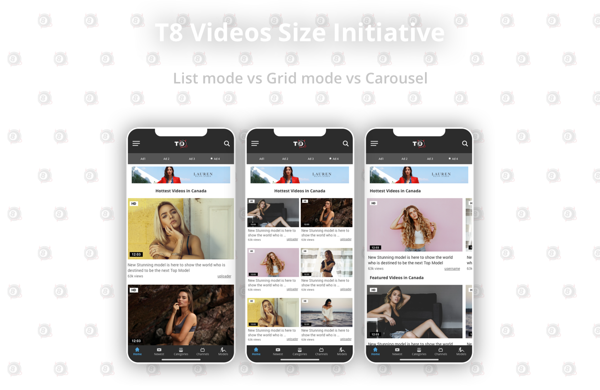
List vs Grid vs Carousel
Let's take a look at the tale of the tape.
|
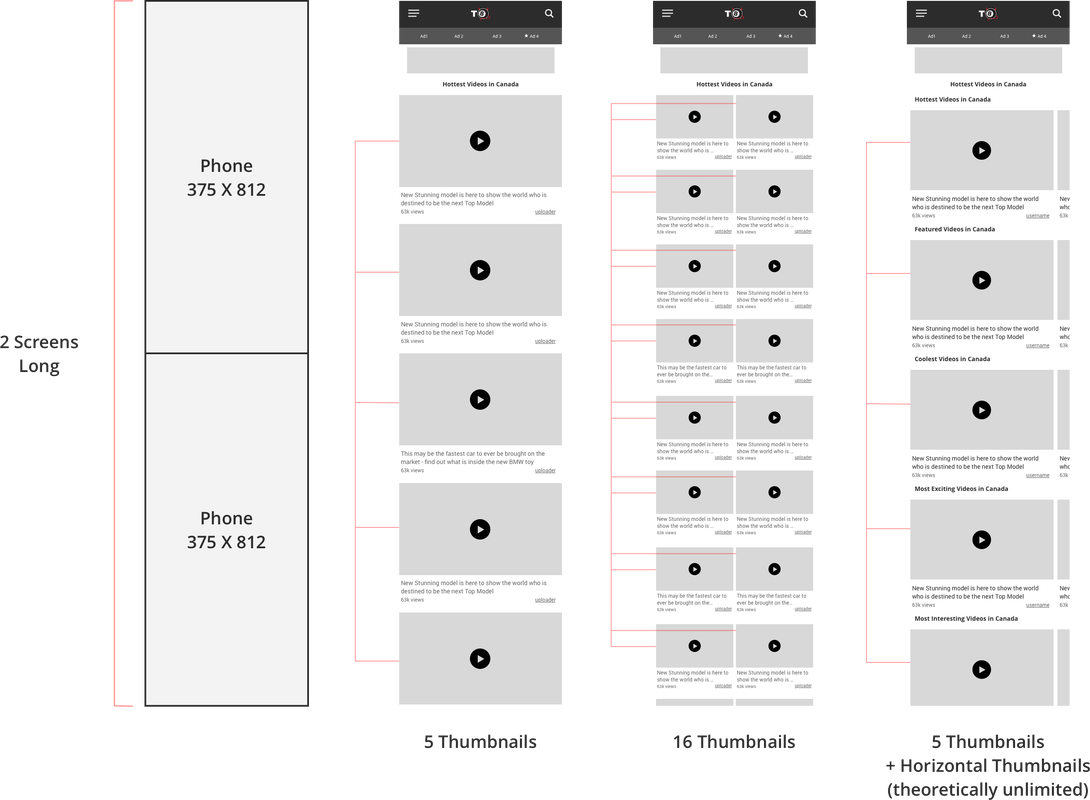
Taking a look at how many screens may be available on 2 screens (large screens - if I may add) it is interesting to see the exposure of the number of videos. It seems that there may be a clear advantage to efficiency in number of videos seen in 2 screens for Grid mode - but it has a significantly smaller screen compared to List and Carousel Mode. Let's take a look at each of these options with more depth.
|
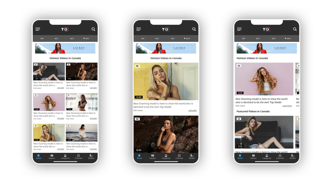
List Mode
Okay so let’s tackle the obvious first - List mode is great. The phrase ‘if it ain’t broke don’t fix it’ could not have been more appropriate here. Despite this being the case, I took something that I learned from my good friend and mentor Dave and applied it. He always pushed for the exploration of something that was completely left field. Innovation is the product of this kind of thinking and enabled me to challenge the status quo. The alternative would have many uttering the words ‘let’s just leave it’ - which is not what UX design is about.
|
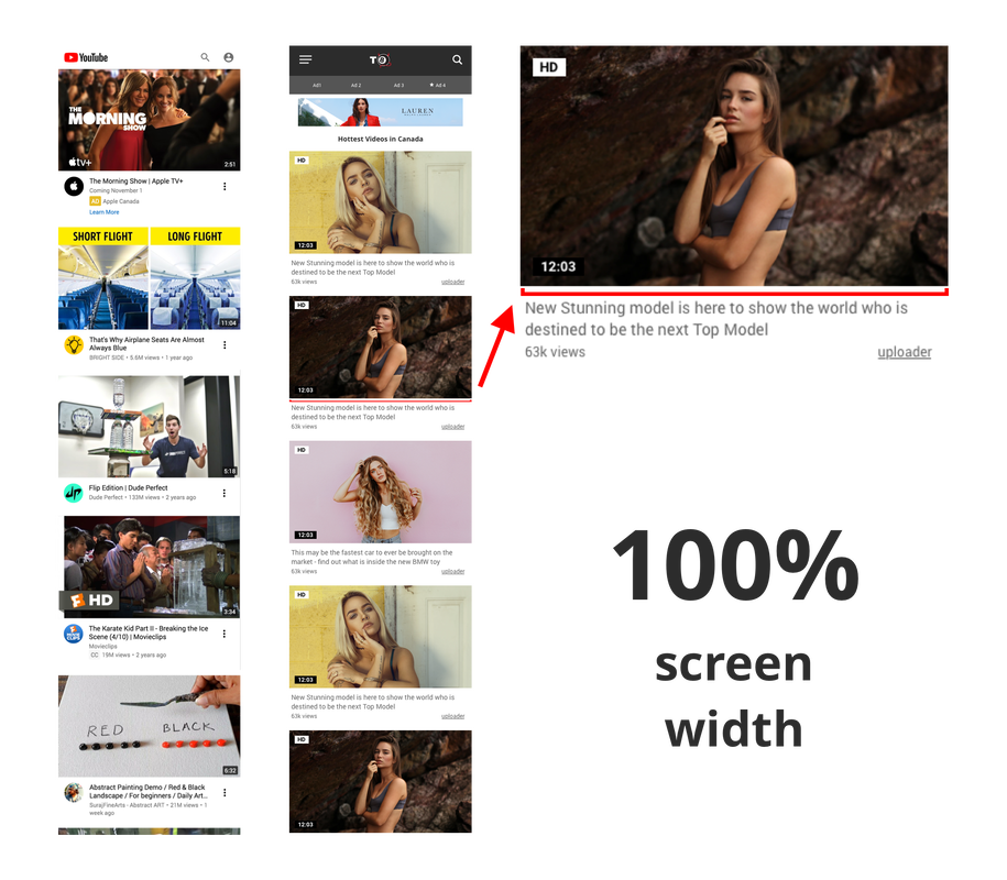
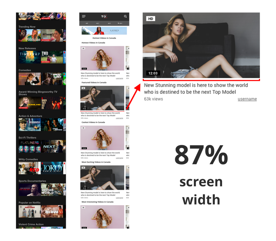
The big pro here is that the thumbnail picture is nice and big for the user to make a decision on whether they are going to click the video or not. We know that 85% of the clicks on thumbnails are visceral and visual (especially on our site). The secondary information(video title, views, etc) are also stretched across the entire width of the screen for the user to digest.
The user will interact with this setup by scrolling down to view more content. As is, our site(on mobile) shows a total of 24 videos vertically before reaching pagination. |
|
Grid Mode
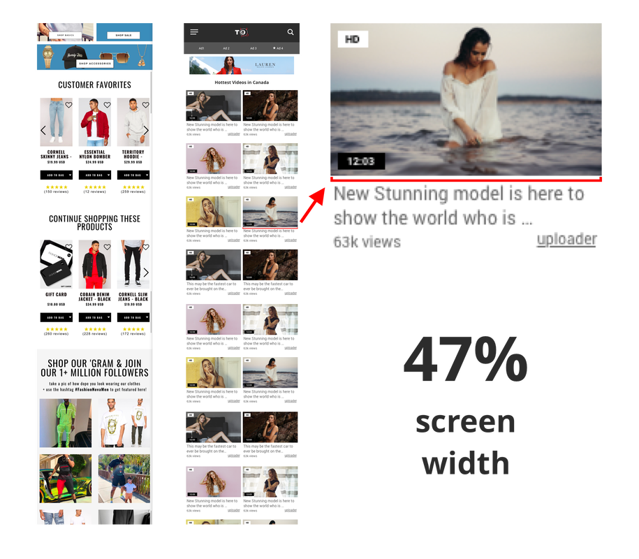
If the goal was to allow the users to gain exposure to different kinds of content - the instinct is to reduce the thumbnail image sizes to be able to put more on the screen. But is this the best way to handle this problem? In theory, splitting the screen in half may be a great solution to double the amount of videos that the user views on a page without scrolling.
|
Will this affect the way our thumbnails are able to draw users to click? Knowing that 85% of the clicks are because of the preview image(or video), the issue of visibility may be an issue.
This design allowed for us to have 24 videos at almost half the space on the page. Our ad partners(and importantly my PM) liked this idea… |
|
Carousel Mode
Carousel Mode was an option that was super interesting to explore since it allowed for sections and categories of videos to be pushed up on the page but also allowed the thumbnails to keep a decent size for mobile.
|
It seems that this can be another viable option - if the goal is to point attention to the difference sections or categories of the site.
In theory this was something that gave a clear direction to: Scroll vertically: to discover the many sections of the homepage Swipe horizontally: for content within the sections/categories |
|
The Results
Throughout the years, as our line of products evolve, the tendency was that thumbnails that were larger generally did better for the users. As I mentioned above - a large portion of video clicks were because of the thumbnail. Despite a high rating or amount of views, the thumbnail preview prevails. So yes, List View wins because of the size of the thumbnail.
Knowing this, testing how users interact with grid view(splitting the screen in half) and carousel(75% thumb decrease) will confirm or unravel this notion.
Knowing this, testing how users interact with grid view(splitting the screen in half) and carousel(75% thumb decrease) will confirm or unravel this notion.
|
This shows the importance of placement on a page. This also shows that page height matters.
|
Ongoing
|
Right now - we are collecting data to ensure that there is a clear winner between all three layouts. Without anything significant and conclusive(because of sample size) - we can see that users have a preference to the layouts in this order:
1. List 2. Grid 3. Carousel and may be so(with a slight bias) because... |
1. This is the traditional way of viewing this kind of information so users are trained to prefer this. It is also a swipe/scroll vertical action as opposed to introducing the horizontals swipe.
2. Users liked the fact that they were exposed to more videos but preferred List mode because of the large thumbs(duh) despite saving page height 3. This layout forces the user to use two different types of interaction (horizontal and vertical) and users seem to just care about seeing as many videos as much as possible right away. It is important to note that if this was a different product that put an emphasis on sorting/categorizing (like Netflix) then the outcome might be a little different. |
Key Takeaways
As it turns out - our instincts and original thoughts were correct. At least at this point in time, users prefer to have bigger thumbnails and prefer to scroll with one action (Duh) over being presented with double(but smaller) previews.
|
Still, it was interesting to take a look at the relationships between these three layouts. At least we can walk away with a level of confidence that we learned a little bit more about the user.
I was also looking into the concept of information overload and how that would play into these designs but unfortunately we currently don’t have enough data or a means to collect this kind of data (at least right now). |
|
Humans(Users) are visceral beings that have visceral reactions to visceral things. In this case, with the content being as visceral as it is (super sensitive and intimate) - us creators must also rely on our visceral reactions to arrive to a situational solution.
|
|
Thank you for sitting through this study and learning with me. If you have any questions or comments do not hesitate to reach out and send me an email!
|